

For this project, I reimagined the visual identity of Everyday Art Magazine as Every/ART, bringing a contemporary lens to a publication originally rooted in the early 20th century. The original logo, with its stark contrast between the thin, spaced-out "EVERYDAY" and the bold, blocky "ART," felt very much of its time, evoking the industrial arts era with a rigid, almost poster-like feel. While it had historical charm, it lacked cohesion and felt visually divided, almost as if "everyday" and "art" were two separate concepts rather than a unified idea.
In my redesign, I wanted to create a logo that reflected a more modern and inclusive vision of creativity, something that speaks to how art exists in the everyday. By merging the two words into Every/ART, I emphasized that art isn’t separate from daily life, but an essential, constant part of it. I chose clean, geometric sans-serif typography to bring in a sense of modernity and approachability, while still feeling refined and structured. The forward slash became a key visual element, it’s a subtle divider, but also a connector, symbolizing movement, evolution, and the blending of ideas. I also played with the "A" in ART, giving it a unique, slightly deconstructed look to hint at creativity and breaking the mold.

Editorial Branding Guide

Sample Cover

Centerspread

Table of Contents and Ad page

Editorial

Instagram Squares

Promotional Poster

Samples of the Previous Brand
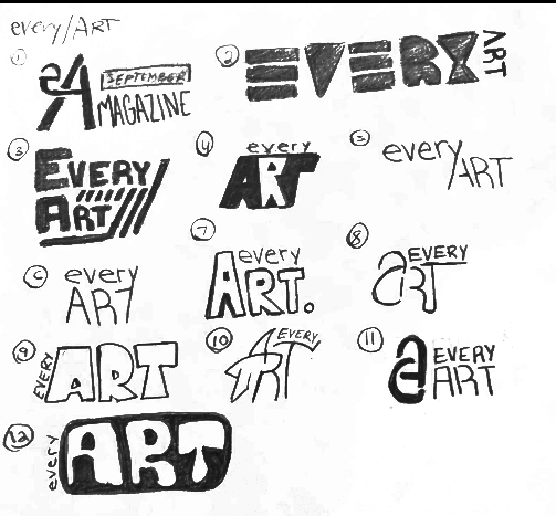
Preliminary Work